

Kawit as a historic town in Cavite is yesterday’s news. If there is something about it that not everyone is already aware of, it would be a font launched late last year which is coined from the municipality’s name.
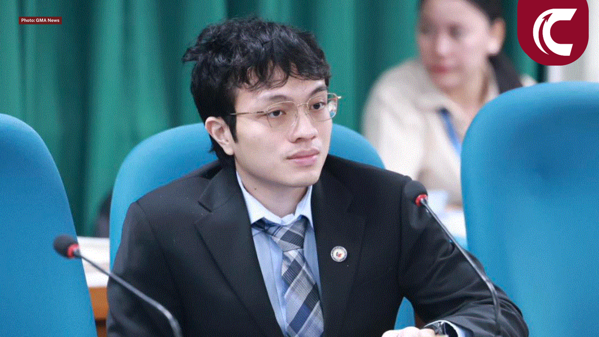
Typeface designer Aaron Amar, the font’s creator, tells the story behind the lettering, which symbolizes Philippine revolution and independence.
In your own definition, what is typeface design?
“Type design is a tool for expressing an artwork or design. Choosing the right font adds context, tone, personality and meaning to words or texts. Like choosing an actor for a specific role, it should match their look and character. Creating a typeface for me is like giving birth to a baby, you give life and soul to it.”
Why make it free? Give at least three reasons.
First of all, I just want everyone to enjoy and appreciate these fonts that I created, especially for non-profit organizations and those who cannot afford to buy a font. Second, I don’t think I deserve to sell these fonts as they are my original style, they are all inspired by other’s work. Lastly, who hates free, ‘di ba?
Aside from this font for Kawit, have you also designed other fonts?
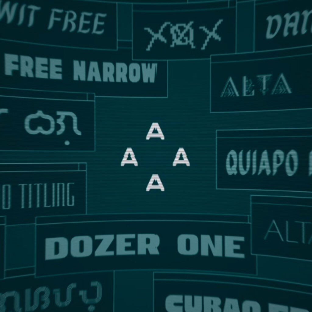
Yes. I’ve already done some free fonts such as Quiapo, Cubao, Dangwa, and Furgatorio and have also tried selling fonts like the Alta series.
How long did the process take in creating the font — from setting the concept to testing it? What is the most challenging and the easiest step for you?
It took me around a week or more yata kasi multiple weights. The most challenging part for me was balancing the weights of every character plus the spacing and kerning. The easiest one would be testing the font.
What are your concepts, inspirations references and pegs in creating Kawit font? Of all the places, why did you choose Kawit?
Acutally, my inspiration here was yung mga swashy brush lettering that we mostly see on local, old prints and mostly used for folk culture and also that Lungsod ng Maynila emblem I’ve seen on a painting at National Museum. Also that old Sagisag ng Pangulo ng Pilipinas emblem text— those were my inspirations for the typeface. Then following the other Filipino typefaces I made, it should be named after a place. I chose Kawit because it’s where our Independence was declared, as Kawit Free gives us that nationalistic and patriotic “fight for our countrymen” character.
You mentioned in one of your interviews that you have not been in Kawit yet. Are you looking forward to visiting the town and what are your expectations?
It’s true, I haven’t been there and I would love to see Kawit in person hoping to learn some of its history.
What are the contributions of your Filipino-themed fonts to our culture and history?
I think it mostly caters to our kapwa graphic designers that need a Filipino style texts on their projects, but also it’s a project that we also have our own style and culture when it comes to typography and type design, especially yung mga gawa ng mga signmakers natin.
–
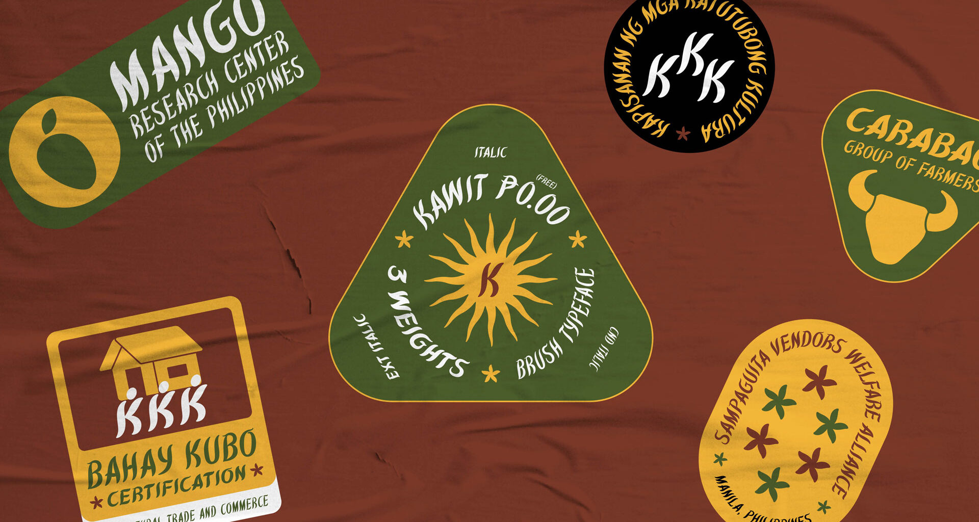
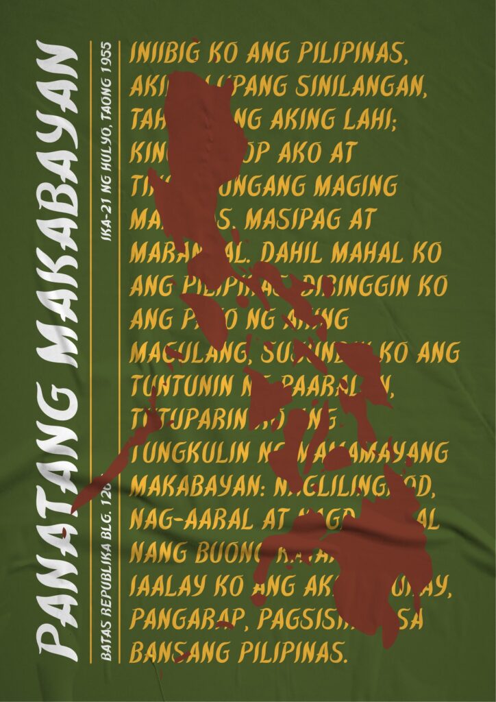
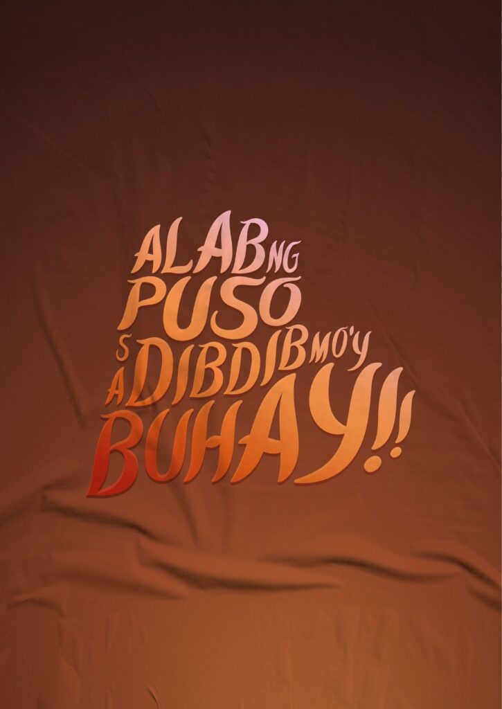
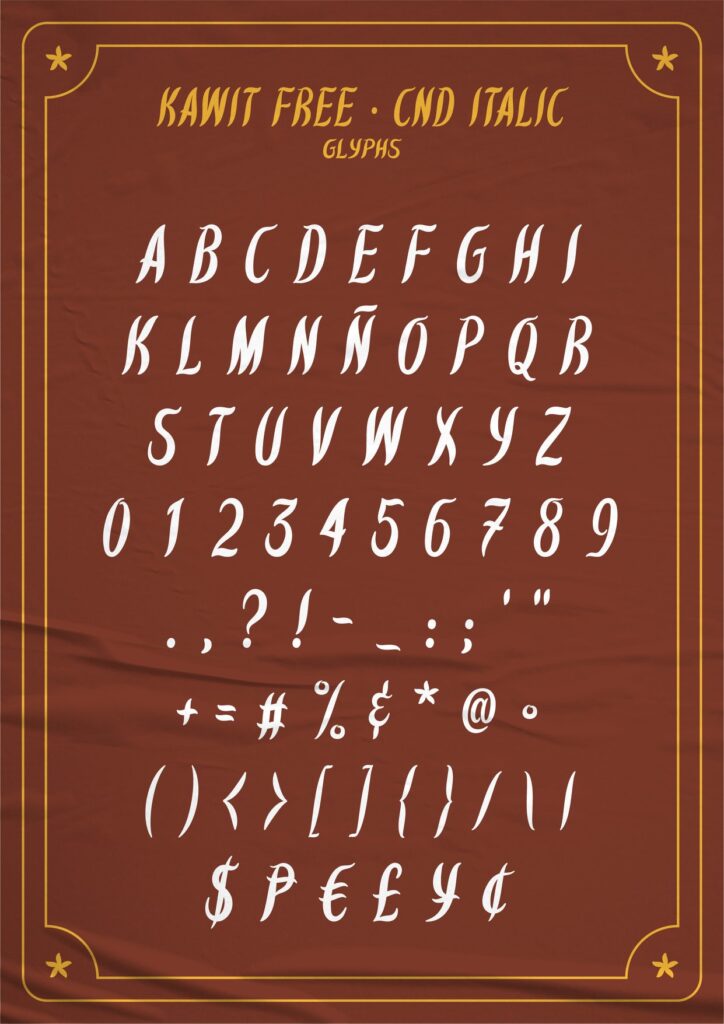
As Amar describes his font, “Kawit Free is a Brush Italic Typeface with three weights, inspired by the curves and swashes of old letterings seen in the Philippines, such as former government agency emblems or seals, some old local prints or signs that represents the country.”

He dedicates his creation to his fellow countrymen “that all strive for the country’s sovereignty, unity, equity and freedom.”
Those who want to try using Kawit font and other Filipino-themed fonts for personal and commercial use may visit Amar’s gallery in popular portfolio website Behance.